Conversion rate is usually the main metric that entrepreneurs use to measure the success of their business. Companies invest a lot to increase their conversion rates and to improve sales as a result. However, they often underestimate how UX design influences this really important metric. With some simple tricks and UX methods, you can significantly raise your conversion rate.
In this article, we will try to analyze and offer some practical solutions to solve common User Experience issues that are related to poor conversion rates. We will also present how to formulate a valid resolutive hypothesis. User research and other UX methods listed below can be conducted independently or in conjunction, depending on the problem and the product you have.
Conversion rate: facts and figures
Before we move to the main UX problems related to conversion rates, let’s take a closer look at some numbers that prove why it’s important to pay attention to UX design. As a good rule of thumb, most companies reach a conversion rate of 2–3 percent.
If your conversion rate is below 3%, you should start worrying. There can be dozens of explanations of such bad performance, but if your web analytics show that your conversion rate is low, your digital product may be suffering from usability issues.
The lack of UX strategies is still a big issue form many product teams. Although ignoring UX principles and good practices can negatively impact conversion rates, nowadays UX professionals seem to face a sort of resistance from many product owners to allocate time and resources to improve User Experience.
For instance, according to the 2017 UX Industry Report by UXPin , 50% of more than 3,000 UX professionals surveyed believe that testing designs with users is still a challenge:

It’s clear as day that testing designs with users is still a major challenge for companies
The reason for that can be any of the following:
- People might be afraid to start testing because they believe they lack the necessary expertise to plan, conduct and analyze user tests;
- Finding and recruiting the right users for your test seems to be a big problem for many companies;
- No time and/or budget.
UX techniques can save you money

The lack of a UX approach affects business revenue. This is not a theory or an assumption. 74% of business owners see an increase in sales after improving UX.
In another design study of 408 companies we learned that higher investment in UX translates into more sales, higher customer retention, and improved customer engagement. Studied companies which invested the most in UX saw a 75% increase in their sales.

Moreover, according to experiencedynamics.com , teams that follows good UX practices may reduce the time that developers spend on re-work or ‘fixing’ a product by up to 50%.
Your UX strategy
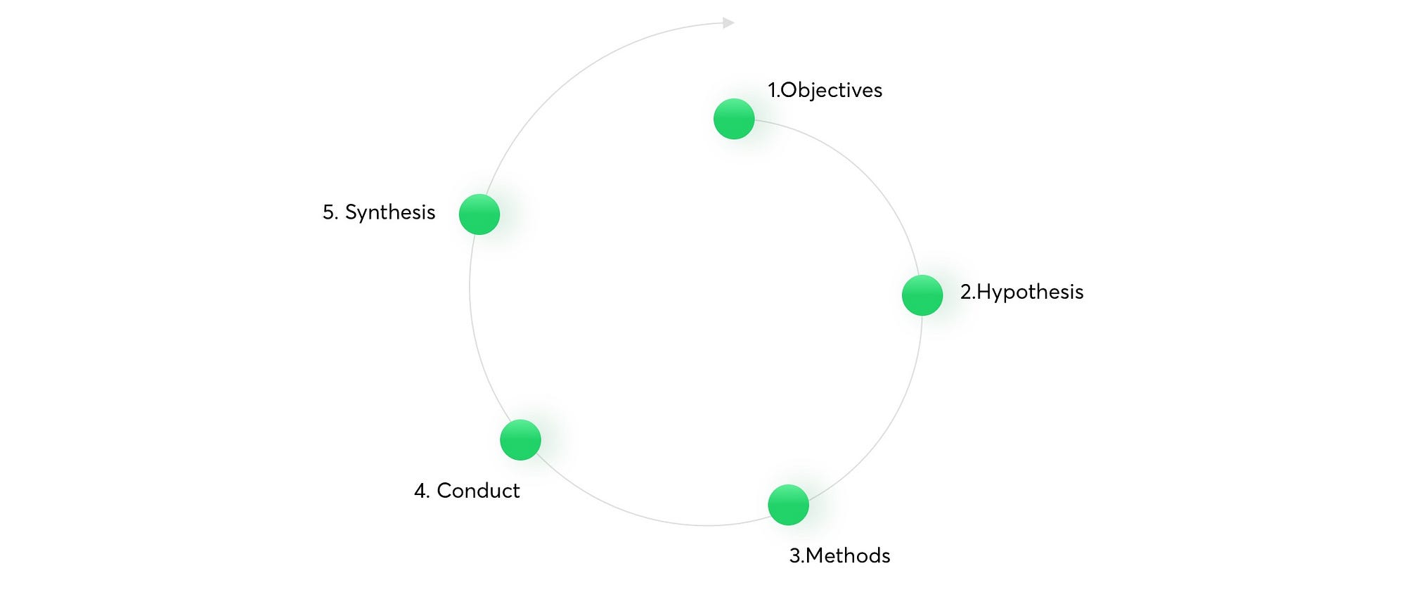
Ok, you are probably now realizing that your product needs a UX design review or a new strategy. But how to understand if your product conversion rate can be improved, and how can you spot exactly where to intervene? How can you see if a wrong design choice or a bad user experience can influence the rate and ultimately damage your revenues? There is no a golden rule or standard recipe. There are many UX techniques, and it’s up to the UX professionals to pick the best methods to get the best results. Conversion rate optimisation requires relentless work and constant testing. However, a good place to start is the research-backed observation that design processes always follow the same generic pattern:
- Set objectives
- Form the hypothesis
- Choose methods
- Conduct research
- Synthesis of the element

Main reasons behind low conversion rates
There might be many reasons behind poor conversion rates , including ones not related to design. Here we’ll focus solely on UX- and design-related causes and we’ll propose effective solutions to fix the problems with low conversion rates.
1. Bad CTA
70% of small business websites lack a clear call to action (CTA) on their homepage. Calls to action can have two more critical issues: copywriting, and visual or interface-related issues.
A call to action written with ambiguous and unclear language leaves users wondering what will the consequence of their click be. This can bring frustration and eventually prevent users from clicking the button.
On the other hand, your main website button might be visually lost. Being your most important element, the one that will generate conversions, it must always be prominent.
Fix: This prominence can be achieved by making the buttons unique. Consider reorganizing the information architecture of your page by making the CTA easier to find using a primary color that will make it stand out from the crowd. Also, in the case of CTAs less means more. In fact, limiting the number of button on a page will make them appear important to the user. When you provide too many options, your users will likely end up in the so-called Paradox of Choice .
UX techniques: You can use a Product Design Sprint to fast validate your assumptions and create a bunch of viable solutions. Afterwards, run Quantitative User Tests to empirically experiment and validate which one of these solutions is the most efficient.
2. Poor copy
Users spend an average of 5.59 seconds looking at a website’s written content. In this time frame, they should clearly understand the consequence of any of their actions or get the Unique Selling Proposition of your product. Why should they use your website or app? Is it clear? The labels of buttons, a caption, or an explanatory text may dramatically affect your conversion rate and how your users or clients interact with your product.
Fix: Make all text clear and optimise all micro-copy that appears before, during, and after any user interaction. This means you should always design the proper copy to trigger the user to perform the right action (e.g. Do you want to remove this user?), indicate clearly what result the action will generate (Remove user), and give feedback after performing the action (The user has been removed) .
Arrange text in a way that is easy to digest, removing unnecessary information and anything that may confuse visitors in order to minimize any doubts. Try to help the user make a decision on what action they are going to perform and why it will be the right one.
UX techniques: Validate with User testing / Qualitative Interviews / Good UX microcopy practices.
3. Flow blockers — intrusive or unnecessary steps
When creating an onboarding, a signup flow, or a process wizard, a micro-detail can macro-affect your conversion rate. Also called Pipeline Killers , these tiny details can affect even a perfectly designed experience. Funneling in users to have the company’s value proposition understood, the user’s expectations met, all with a minimal amount of friction, is no easy task. This is because during the design phase it is very hard to understand all the possible variables that could push a user to abandon the task they are supposed to perform on your website in order to achieve a desired action.
Fix: The crucial point is to spot where your users drop off. This is a quite obvious but often neglected action that every product owner or UX designer should take. In order to individuate and solve your Pipeline Killer, you first need to create a funnel using an analytic tool such as Mixpanel, Hotjar or Google Analytics. Having found the problem, you can consider running a Design Sprint to solve it. After finding a possible solution, validate it by performing user testing and monitoring the quantitative data from your funnel.
UX techniques: Funnel / Design Sprint / User testing / Qualitative Interviews
4. Too broad or not the right target audience
This should be one of the first steps of any Product Design Process. Obviously, you can’t create a good user experience while ignoring who your users are. You should understand who are the people that use your product, what are their demographics, what is their behaviour, where they spend the most time, and how they communicate. With such information, you will be able to design experience in line with their preferences and create a message that would resonate with them. If you fail to clearly specify who your users are, you won’t be able to authentically connect with them and, as a result, they won’t buy your product or service.
Fix: At Netguru we tend to start any design process by running a workshop with the client to better scope our work, and to get aligned with the client’s expectations and business needs. We know that knowing users’ needs and their real problems is often underestimated. For this reason before running a Design Sprint, we define the target audience in order to discuss it with our client and calibrate the right design strategy. User age and gender helps to determine what language to use and what tone to take. Good UX design is about showing them the best way to to use their motivations to nudge them towards achieving their goals using your product.
UX Techniques: Personas / focus groups / target analysis / Ethnographic research. Together with the Product Owner create an ideal user profile and craft your UX design specifically for them. Create a fictional persona that carries the characteristics of your target audience.
5. Underestimating user motivation
Sometimes even the best crafted interfaces can suffer from poor levels of conversion. It doesn’t matter how much you tested them, they still do not perform as expected. So how do you increase conversions, or better yet, how can you influence user behavior in order to achieve a better conversion rate?
Fix: Try to understand the psychology behind your users’ motivations and cater to those motivations through an effective UX strategy. In that way you will ensure that your product can be tailored for your audience.
Gamification, steppers, and percentages act like triggers. Educate your users with short and direct instructions.
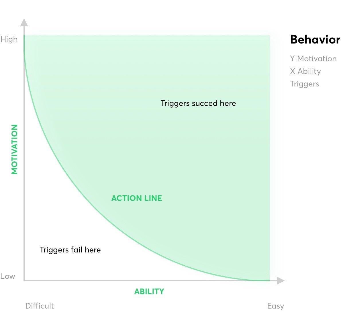
To understand user motivation and to create a coherent UX strategy, the Netguru Design team often uses a tool called the BJ Fogg’s Model:

According to this model, three elements have to be present in order for a specific behaviour to occur: motivation, ability, and triggers. In other words, if you want to increase the number of users who complete a given action in your product you must ensure that they are:
- Motivated: Do they really need to perform a given action?
- Able: Can they do it easily? Is your app usable?
- Triggered: Have you triggered them to perform the behaviour? Do you have a good and self-explanatory call to action? Are you assisting your user by giving them transparent and straight feedback after each action or step?
UX techniques: Psychology of Motivation and Behavioural analysis
Conclusion
Data evidence is the best tool to spot weaknesses and improve your digital product experience. Often this can be solved by well documented UX techniques which each UX design agency should mix together like ingredient of a magic potion. If you are looking for a way to improve your conversion rate and you don’t from where to start, remember that you can count also on a Netguru UX Review .
Originally published at https://www.netguru.com.
