Product Designers know that choosing a good font can be challenging and frustrating due to our client’s budget restrictions. For this reason, I created this collection of nice Gothic and Grotesque fonts that you can use for free in your next project. I hope you will find it helpful.
Plus Jakarta Sans
Designer: Tokotype
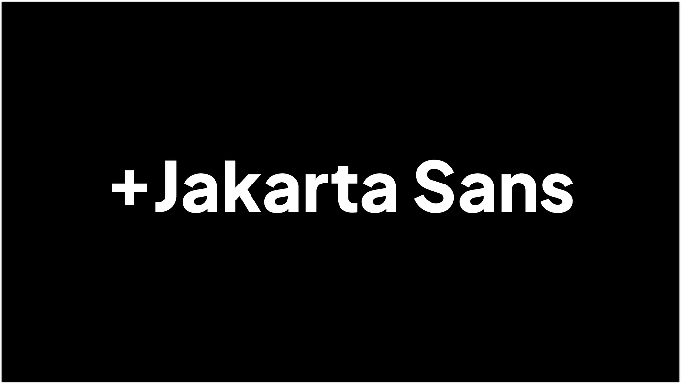
Plus Jakarta Sans is a fresh take on geometric sans serif styles, designed by Gumpita Rahayu from Tokotype. The fonts were initially commissioned by 6616 Studio for Jakarta Provincial Government program’s +Jakarta City of Collaboration identity in 2020.
Taking inspiration from Neuzeit Grotesk, Futura, and 1930s grotesque sans serifs with almost monolinear contrast and pointy curves, the fonts consist of modern and clean cut forms, the x-height dimension slightly taller to provide clear spaces between caps and x-height, and also equipped with open counters and balanced spaces to preserve the legibility at an extensive range of sizes.
Bricolage Grotesque
Designer: Mathieu Triay
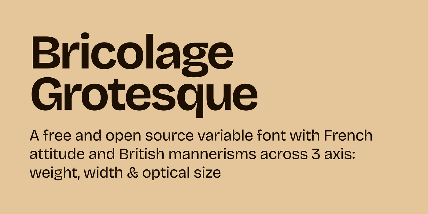
Bricolage Grotesque is a collage of many different things: historical sources, technical decisions, and personal feelings. It started as a fork of Mayenne Sans, an open-source single-weight font designed by Jérémy Landes (Studio Triple). It evolved by reinforcing cues from French sources and British sources: the compressed weights lean more towards the anxious and wonky tones of Grotesque Nº9, and the regular weights have a bit more of Antique Olive’s relaxed and confident attitude. The smaller optical sizes become more neutral and reflective of contemporary sans serifs, notably through the use of exaggerated ink traps.
Public Sans
Designer: USWDS.
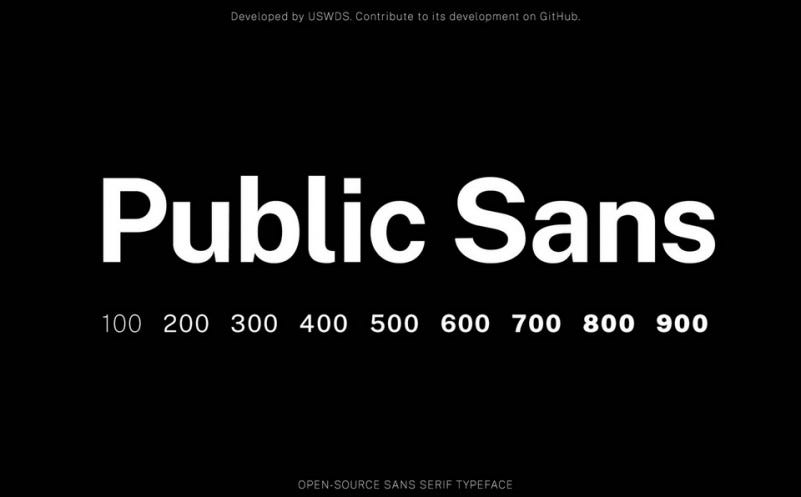
Public Sans is a strong, neutral typeface for interfaces, text, and headings. It comes with 9 weights, as well as with variants and web fonts.
Public Sans is a fork of the SIL Open Licensed face Libre Franklin. It has many similarities with its parent but differs enough in its particulars that its effect is distinct. Public Sans differs from Libre Franklin in its focus on long-form reading and neutral UI applicability. It takes inspiration from geometric sans faces of the 20th century and the original Franklins of the 19th, resulting in something of a mongrel face that retains its American origin.
Space Grotesk
Designer: Florian Karsten
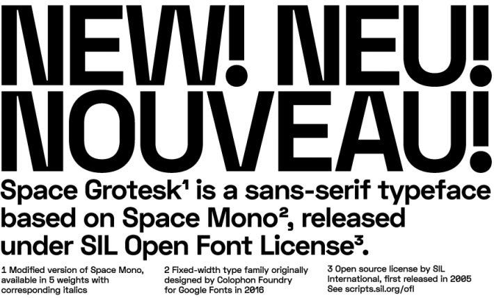
Commissioned in 2017 by Jakub Konvica and Lukáš Dobeš, Space Grotesk is a modification of Colophon’s open-source typeface Space Mono. It is a three-weight proportional version of the original Space Mono, which proved to be a solid display typeface. Space TIC was later complemented with a single-weight text version (Space TIC Text), which created a baseline for Space Grotesk.
Space Grotesk supports Latin Extended-A character set (i.e. Western European, Central European and Southeastern European languages) and several OpenType features.
Inter
Designer: Rasmus Andersson
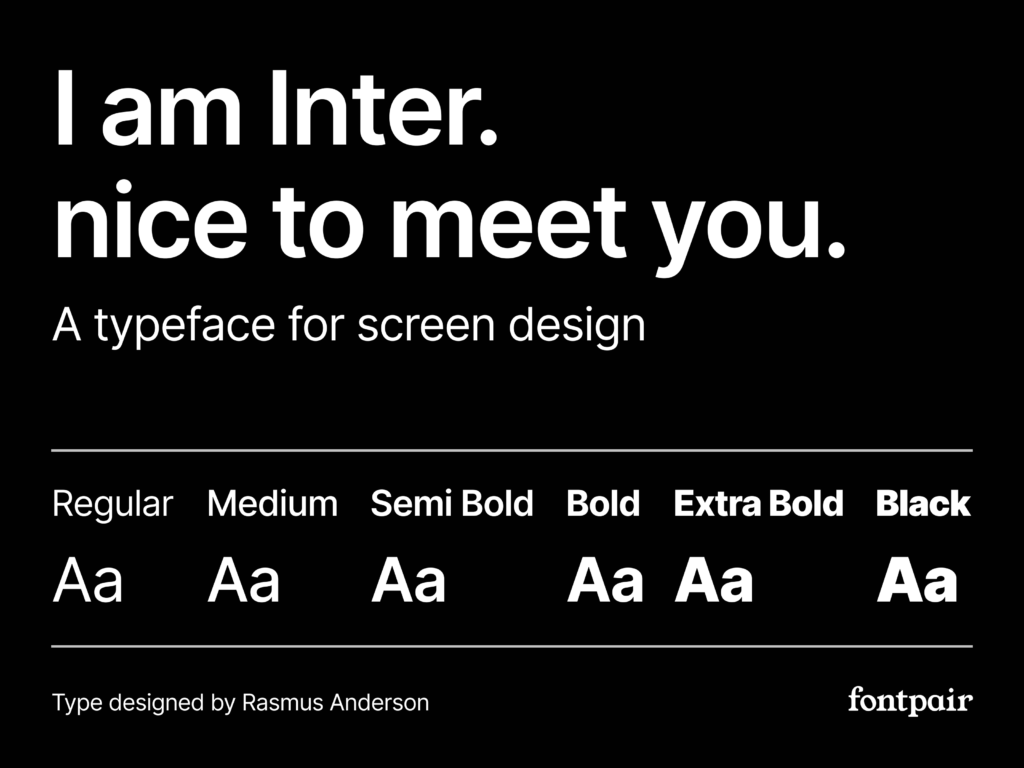
Probably the most popular sans-serif font among designers right now, Inter is a versatile typeface carefully crafted & designed for computer screens.
Inter is a font family for highly legible text on computer screens. It’s open source and free to use in almost any way imaginable. Inter started out in late 2016 as an experiment to build a perfectly pixel-fitting font at a specific small size (11px.) The idea was that by crafting a font in a particular way, with a particular coordinate system (Units Per EM), and for a particular target rasterization size (11), it would be possible to get the best of both sharpness and readability.
HK Grotesk
Designer: Alfredo Marco Pradil and Stefan Peev
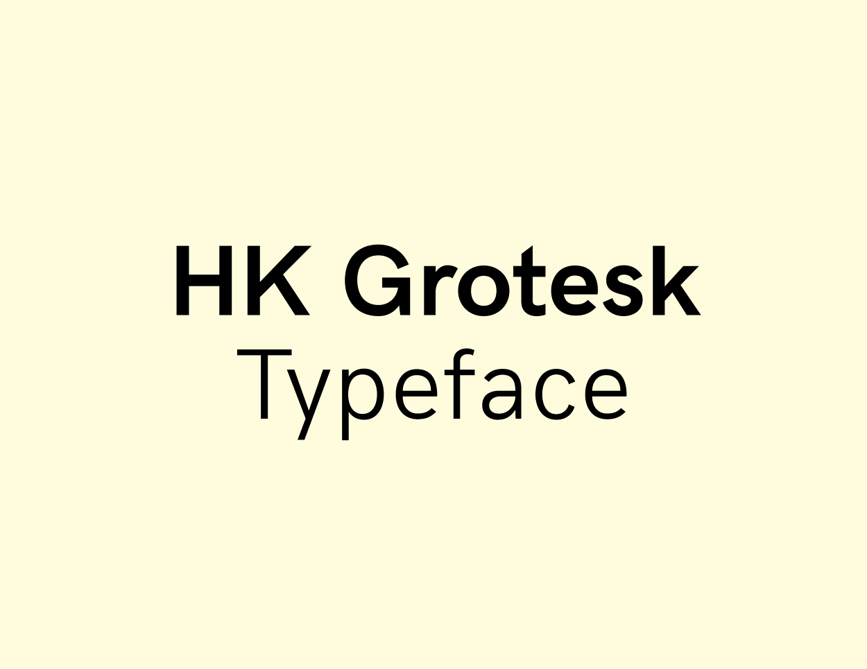
HK Grotesk Pro is a sans serif typeface inspired by the classic grotesques. It is a multi-purpose typeface that can be used on a wide range of topics without being obtrusive to the reader’s eye. It has features that can be identified with Akzidenz Grotesk, Univers, Trade Gothic, and Gill Sans typefaces.
Anderson Grotesk
Designer: Stephen French
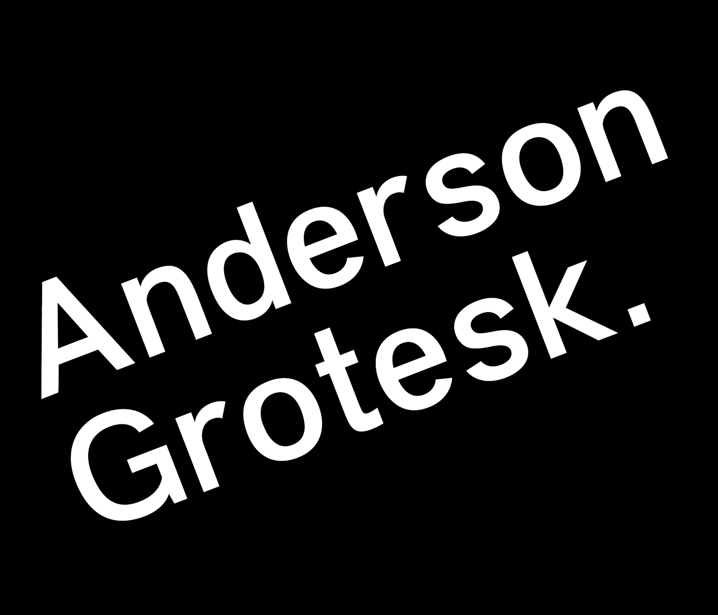
Anderson Grotesk Free Font is a hand rendered Neo-Grotesk typeface. It currently exists in two weights, but more are on the way! This typeface is great for editorial, logo, branding and other formal purposes.
Vremena Grotesk
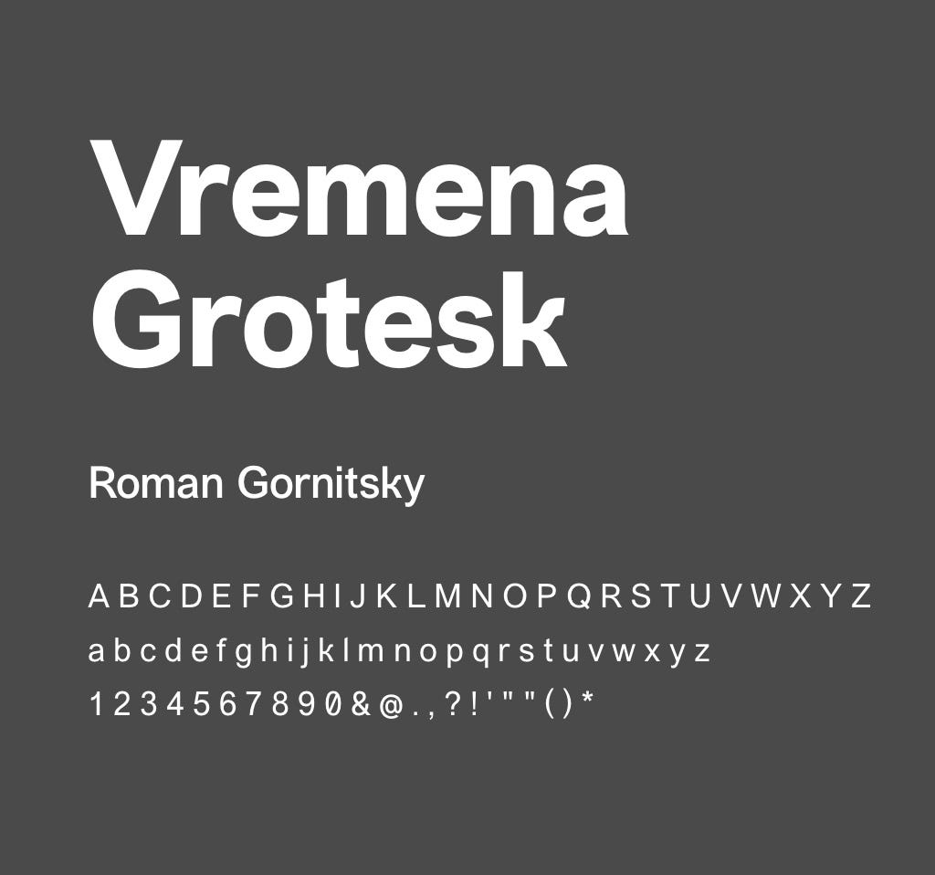
Designer: Roman Gornitsky
Vremena project is a tribute to two most widespread typefaces of the early millennium — Times New Roman and Arial. The family consists of four regular weights and four italics.
Karla

Designer: Jonny Pinhorn
Karla is a grotesque sans serif typeface family that supports languages that use the Latin script and the Tamil script. This is the Latin script part of the family, with Roman and Italic styles in two weights, Regular and Bold.
Nunito Sans
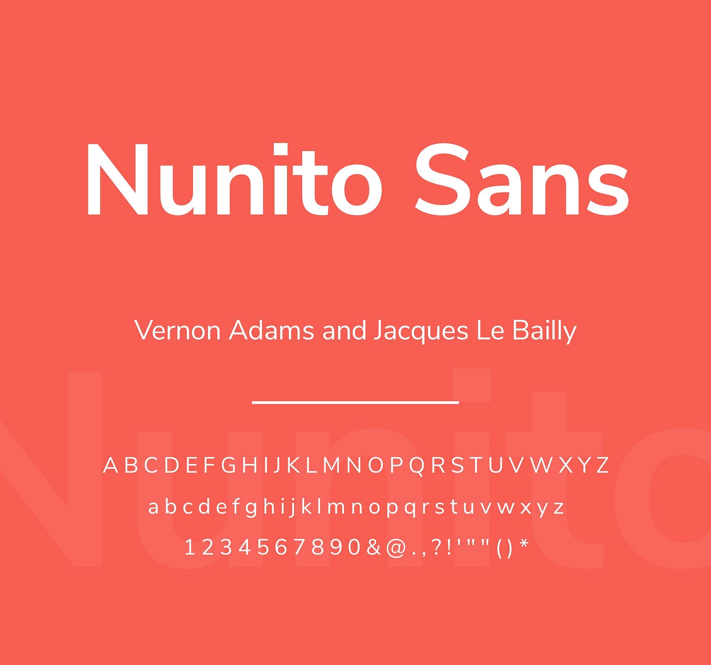
Designer: Vernon Adams and Jacques Le Bailly
Nunito is a well balanced sans serif typeface superfamily, with 2 versions: The project began with Nunito, created by Vernon Adams as a rounded terminal sans serif for display typography. Jacques Le Bailly extended it to a full set of weights, and an accompanying regular non-rounded terminal version, Nunito Sans.
I try to expand this list by adding new fonts during the time. If you have some free grotesque font to share, please feel free to add it to the comments, and I will add it to the article.
📝 last update November 2023
